Designing your form
Colours, fonts, the cover and success pages, and your brand kit.
Select Form in the builder's left menu, then the Design tab in the right panel. Changes show on the form straight away.
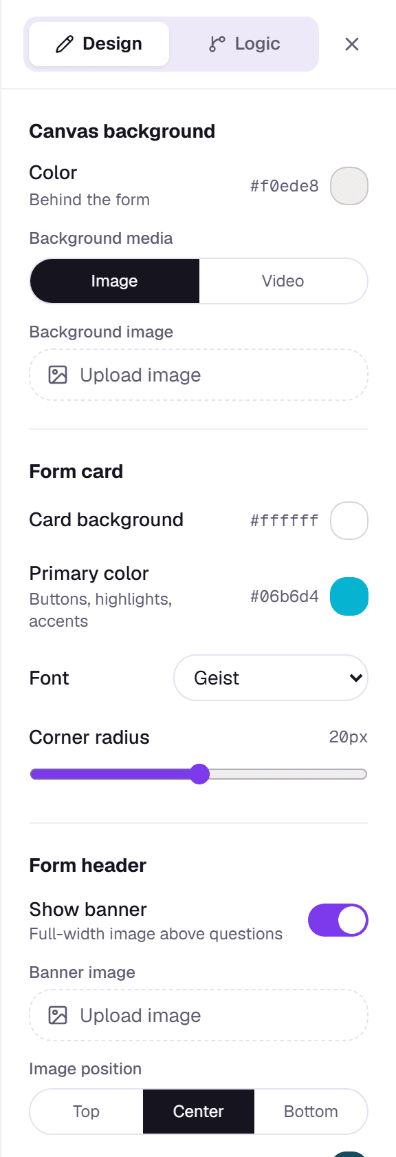
- Canvas Background: the colour behind the form, or a background image. A background video needs Pro.
- Form Card: the card colour, the primary colour used for buttons and highlights, the font and the corner radius.
- Form Header: an optional banner image across the top and an avatar image.
- Behavior: a progress bar, question numbers, and One question at a time (Pro), which shows questions one per screen. Once a form has responses, this mode is locked so your analytics stay comparable.
- Branding: hide "Made with Formz" (Pro).
Cover page and success page
Cover page in the left menu adds an optional welcome screen with a title, subtitle and start button. Success page sets the thank-you message shown after someone submits. It can have up to two buttons; give a button a redirect URL to send people to your own site, or leave the URL blank to keep it as a plain button.
Social preview
Under Settings → Social preview, upload the image shown when your form link is shared on X, Discord or Slack (1200×630 works best).
Brand kit
Plan: Pro and Business
Set your logo, brand colour, company name and a default share image once under Account → Brand kit. With Apply to new forms on, every new blank form starts with your logo and colour. Templates and forms you've already made keep their own look.